Sunday, May 28, 2017

Card Design: Gerda Steiner Designs Progressive Challenge...May

http://gerdasteinerdesigns.com

Hello there! It is time to get my progressive card for the Gerda Steiner Designs Progressive Challenge uploaded.

Check out the adorable image that we got to work with this month...
Flowers for you - Digital Stamp

Everyone who played along in last month's challenge received Flowers for You for free. It has a version with the sentiment and one without. If you decide to hop on and play along in the Gerda Steiner Designs Progressive Challenge, then you can purchase this digital by clicking HERE (or on the watermark above to head to its location in the store). This way you'll receive next month's digital stamp for free.

Here are my card and details...

General Info:
  • This card has been created 100% digitally and then layered in a Mock Up (courtesy of Frisk Shop). I will print it out and assemble it a later date.

FRONT

Digital Image Details:
  • Flowers for You: You can find this image in the store. Details above. 
  • This image was coloured digitally using Photoshop Elements.

Digital Embellishment Details:
  • The flowers and leaf spray are from the Floral Accessories section of my Tag Grab Bag 1: Cotton Candy Collection which is available for sale in the Scribbles Designs store. You can find it HERE.
  • The buttons are from the Brads & Buttons section of my A Touch of Class kit which is available for sale in the Scribbles Designs store. You can find it HERE.
 

INSIDE


OVERALL
 Digital Sentiment Details:
  • The sentiments on both the front and inside were created by Paulette from Create with TLC. For great freebies and inspiration be sure to click HERE to go to Paulette's blog and for awesome sets for purchase, click HERE to go to the home page of the store. Both have been recoloured to suit the purposes of this project.

Digital Paper Products:
  • The paper used for the background on the front and inside, along with the dotted paper used as an accent on the front, are both freebies available on my blog. Click the respective watermarks below to find them.
http://decossesdynamitedoodles.blogspot.ca/2017/04/freebie-alert-card-linky-party-happy.htmlhttp://decossesdynamitedoodles.blogspot.ca/2017/04/freebie-alert-happy-birthday-to-my-hubs.html
 
  • The pink paper is from my Fight Like a Girl set which is available for sale in the Imagine That Digistamp store. You can find it HERE.

  • The glitter paper is from my Glitteratti 1 Mini Kit.


Digital Embellishments:
  • I have used basic shapes in Photoshop Elements to create matting in behind the image and the sentiments.  The scalloped shape on the front is also a basic shape.
  • I have applied shadow layer styles to give certain elements some depth. These styles were designed by Sheila Reid, Pixel Scrapper.

Challenges I am entering:

Challenges I am hoping to enter...

Well guys, that is it for this one. I'm busy behind the scenes as usual. The ends of the month are always crazy for me so I'll see again when I can!

Until next time,

Tuesday, May 23, 2017

Promotion: Imagine That Digistamp New Release Giveaway


Hello there folks! I'm just popping in today to let you all know that Imagine That Digistamp is showcasing an adorable new release today.

Check it out...

 http://www.imaginethatdigistamp.com/store/p947/Giraffe_with_Butterflies.html

  You can find it in the store by clicking on the watermark.


How would YOU like to win this cute set?


Simply head on over to the blogpost featuring this set (you can find it HERE) and leave a comment by end of Thursday. There will be a random draw and a winner will be chosen this Friday, May 26th.

Pop over to the blog tomorrow as well to see some New Release samples from the Facebook DT. We'd love for you join the Facebook Group HERE where there is lots more inspiration to be found!

Good luck all and I'll see you again soon!

Until next time,

Wednesday, May 10, 2017

Card Design: Limited Runs Progressive Challenge...May

Limited Runs Badge

Hey folks! I'm here today to post my card for this month's Progressive Challenge over at Limited Runs!

The Progressive Challenge is actually on Facebook (FB) in the Limited Runs Group and can be found HERE. You will need to join the group in order to access the information. Now thankfully, Nikki is willing to accept mailed in entries for those people like me who don't have FB accounts. You can find her email addy in the side bar of the store (click on the image above to head there). In fact, if you don't have a blog, that is okay too. Simply send a photo and she'll add you in.

Check out the fun image that we got to work with this month...


If you'd like to purchase this image you can find it over in the Limited Runs Store on a special page that will showcase all the Progressive Challenge images. Click HERE to head there now. The ELMO With Sign image is available until May 13th at 12:00 a.m. for $1.00, then it will go up to its regular price.

Each round of Progressive Challenges will last for three months and there will be a grand prize winner at the end of each round. As you can see it is almost the end of Round 1.

Challenge #1: Ended March 13th and a winner was chosen
Challenge #2: Ended April 13th and a winner was chosen.
Challenge # 3: Started April 15th and will end May 13th. Those that played the month before received the free digi and those who didn't are able to buy into the challenge for only $1.00.


Then a Grand Prize Winner Will be Picked 
and a new round with a new freebie begins!

If you have any questions at all, please contact Nikki!

Here are my card and details...

General Info:
  • This card has been created 100% digitally and then layered in a Mock Up (courtesy of Frisk Shop). I will print it out and assemble it a later date.
  • I have based my card on an old sketch from My Favourite Things.


FRONT

Digital Image Details:
  • Elmo Emu With Sign : You can find this image in the store. Details above. 
  • This image was coloured digitally using my Rebelle program.

Digital Sentiment Details:
  • This sentiments was created by Paulette from Create with TLC. It is available for purchase in the So So Sorry, Digi Word Art Set which can be found HERE.
 

Digital Embellishment Details:
  • Horizontal strips were created with basic shapes in Photoshop Elements and then altered using a layer style from Marisa Lerin, Pixel Scrapper.
  • Half circle shape was created in Photoshop Elements and then altered using a layer style from HG Designs.
  • Brads are from the Brads & Buttons section of my A Touch of Class kit (more details on this set including availability below).


INSIDE

Digital Sentiment Details:
  • This sentiment was also created by Paulette from Create with TLC. It is a freebie I picked up a long time ago. For great freebies and inspiration be sure to click HERE to go to Paulette's blog and for awesome sets for purchase, click HERE to go to the home page of the store.

Digital Embellishment Details:
  • Washi tape is also from the Strings, Ribbons, & Washi Tapes section of my A Touch of Class kit. The previews for the Brads & Buttons section is above and all the remaining sections of this kit can be seen on my Designs Preview page (link at top of blog in tab section). The bundle or just the paper sets alone can be purchased in the Scribbles Designs store. You can find it for sale HERE.


OVERALL

Digital Paper Products:
  • The paper used for the background on the front and inside is a freebie that I created and is available HERE.

Digital Embellishments:
  • I have used basic shapes in Photoshop Elements to create matting in behind the image and the sentiment. 
  • I have applied shadow layer styles to give certain elements some depth. These styles were designed by Sheila Reid, Pixel Scrapper.

Challenges I am entering...

Challenges I am hoping to enter..
Be sure to pop over to the Facebook Group to find out all the details you need or visit the details page over at the store by clicking HERE.

Take care my friends and I hope to see you all again soon!

Until next time,

Friday, May 05, 2017

Card Design: Pattie's Creations Challenge #134...For the Girls--Use a Feminine Image

http://pattiescreationschallenge.blogspot.ca

Hey folks! I'm here today to announce the next challenge over at Pattie's Creations Design Challenge. This time around for Challenge #134, the theme is For the Girls--Use a Feminine Image. With Mother's Day coming up it's the perfect time to create a card with a feminine image. Additionally, there is always a need for birthday cards, thank you cards, friendship or thinking of you cards for the many ladies in your life!

Here is my card, I hope that I haven't forgotten any important details:

General Info:
  • This card has been created 100% digitally and then layered in a Mock Up (courtesy of Frisk Shop). I will print it out and assemble it a later date.

FRONT

Digital Image Details:
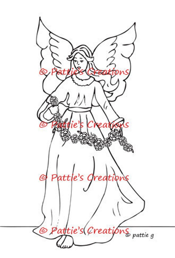
  • Angel With Roses: Such a lovely image. You can find it in Pattie's Etsy shop by clicking on the name or watermark linked below.
  •  This image has been coloured digitally using Rebelle and the background has been paper pieced. Credits include:
    • The 'wallpaper' is paper pieced with a paper from the On Angel's Wings kit designed by Jen Reed, available at {Computer} Scrapbook.com
    • The 'floor' is created using a wooden shelf from FW Studio
    Angel With Roses


    INSIDE

    Digital Sentiment Details:
    • The sentiment on the inside was created by Paulette from Create with TLC. You can purchase it in the Mother My Angel Word Set available HERE. For great freebies and inspiration be sure to click HERE to go to Paulette's blog and for awesome sets for purchase, click HERE to go to the home page of the store. This sentiment has been recoloured to suit the purposes of this project.


    OVERALL
    Digital Paper Products:
    • The majority of the papers used are from the Romantic Roses kit (designer unknown). The paper used for the background on the inside is from the On Angel's Wings kit designed by Jen Reed. Both of these kits are available at {Computer} Scrapbook.com.

    Digital Embellishments:
    • I have used basic shapes in Photoshop Elements to create matting in behind the image and the sentiment. 
    • I have applied shadow layer styles to give certain elements some depth. These styles were designed by Sheila Reid, Pixel Scrapper.

    Challenges I am hoping to enter...


    You have until June 1st to enter our challenge which should give you lots of time to get a creation done. Remember the theme is For the Girls and you must use a Feminine Image. I really hope that you will be able to join us. You can enter twice per challenge and of course MUST follow all the challenge requirements that are posted for each challenge (please click HERE to become familiar with all the rules). In addition to all the typical criterion, you MUST USE A DIGITAL OR STAMPED IMAGE to qualify for the drawing (unless stated otherwise). We would absolutely love to see you use a Pattie's Creations (PC) image on your card, but you are allowed to use other images. If you do use a PC image, you will gain an extra entry in the draw and will have a better chance to WIN!  Easy Peasy right!

    Pop over to the challenge blog and check out what my fabulous teammates have offered up for inspiration. Oh and don't forget...Pattie offers up a new freebie the first Friday of the month and it will remain up for approximately two weeks; so, be sure to pop over and check it out as well!

    Well guys, that is it for this one. Hopefully I will see you all very soon. I miss you guys!

    Until next time,

    Wednesday, May 03, 2017

    Card Design: Path of Positivity Ch. #49--Opt. Theme: PRESENT NOT PERFECT


    Hello there my fine friends! It has been over a year since I have had the chance to create a card for The Path of Positivity Challenge and this month I'll be doing two! The first card I'm sharing is one I created for the the start of the challenge. It is the card I made for my hubby's recent birthday.

    I'll also be sharing the sentiment I created for the start of the challenge, which you can find at the bottom of this post. Don't forget, even though I no longer have the time to share them here, you can always find two new free sentiments each month, always on the first and third Mondays of the month over on The Path of Positivity Challenge; so, be sure to check in over there. I'd love for you to join in our challenges as well. Things have changed slightly this year. While any of the projects entered must still be inspirational, positive or encouraging in some manner, the themes are now optional. Be sure to head on over to check out all the rules for entering.

    Katrina Brown, one of my DT, came up with the optional theme and theme description this month which is all about the idea of being 'present, not perfect'. Here is the theme description to give you a better idea of what the optional theme is all about:
    Have you ever been in the position where you wanted to participate, but you just didn’t feel you had the talent to compete or be accepted? Have you ever wanted to reach out, but you just didn’t know the perfect thing to say? Have you wanted to share, but simply couldn’t for fear of making a fool of yourself?
    We’ve all been in one, and most likely all, of these situations at some point! The need to be perceived as perfect is so strong in some and it keeps us from being present and in the moment.
    Our challenge for you this month is to step out of your perfection zone and be positive about what you have to contribute! Perhaps you visit the site and enjoy the work of others and share something with us for the first time! Maybe you’ve shared many times, but now you will try a new technique you’ve been afraid to try for fear of failing. Possibly you’ve wanted to try doing a video or pictorial teaching aid to go along with your art. Another idea, is to make a sympathy or encouragement card for someone who might need to know you are thinking of them. Don’t worry about the perfect words; a lovely picture can go a long way to convey your thoughts. Of course, you could always share a card encouraging someone else to step out of their zone or letting them know just how wonderful they are just by being present in your life!
    Yes, there really is something to this saying, ‘present not perfect’ that is so positive and freeing. Just jump into the moment and give what is uniquely you!
     Cool right?! Katrina also helped me figure out how to fit my hubby's birthday card to the theme (Thanks Katrina!). Many people have the tendency to put things off thinking there will be a perfect age or time to accomplish their goals. Unfortunately, by putting things off they end up missing out. We think that a certain age or time in our life will be the RIGHT time to get things done. Unfortunately, that time comes and goes and we're nowhere further ahead. We may never have that perfect future we're looking for so we need to stop waiting around for it and start doing things NOW in the present!

    When it comes to our birthday itself, we also need to stop hoping for the perfect day--the ultimate birthday. Many of us have a tendency to build up big expectations for our birthdays, especially the milestone ones. Sadly, we get caught in the idea of how we would like a certain birthday to be, instead of simply being present and enjoying the wonder of our life as we age. Having recently celebrated my 50th, I'm certainly guilty of that! I had such high expectations and as a result was a little disappointed with how the day actually went. I should have just allowed myself to be present and live in the moment instead of expecting it to be perfect. Perfectionism is a trait that I have been trying to break since I was a tween! I really need to get in the mindset of this month's theme and start thinking less of perfection and more of living in the NOW!

    How about you? Do you struggle with trying to be perfect and miss out the present? We'd love for you to share your creations and stories with us this month over on The Path of Positivity!

    This month our sponsors are...

    Shop Our Digis!

    AND


    I opted to work with an image from Imagine That Digistamp for my card for the start of the challenge. Of course what better image to use than the one that I requested Kristy make to honour my hubby and his love for frogs!

    Raymond's Frogs
    http://www.imaginethatdigistamp.com/store/p792/Raymond%27s_Frogs.html

    Here are my card and details...

    General Info:
    • This card was created 100% digitally and then layered in a Mock Up (courtesy of Frisk Shop). It has now been printed out and assembled.
    • I was inspired by an old From the Heart Stamps sketch for this card.


    FRONT
    Digital Image Details:
    • As mentioned above, the image is available in the Raymond's Frogs set. Click on the watermark above to find its location in the store.
    • I have used the precoloured image and just created my own background. Credits include:

    Embellishments:
    • The button used in the lower right hand corner is from my Trick or Treat kit which comes with seven different sets, including the General Elements section previewed below. This bundle can be purchased in the Scribbles Designs store. You can find it HERE.
    •  The three buttons used in the upper left hand area are from my A Touch of Class kit which comes with 11 different sets, including the Brads & Buttons section previewed below. This bundle can also be purchased in the Scribbles Designs store. You can find it HERE.


    INSIDE

    Digital Sentiment:
    • The happy birthday part of the sentiment was created by Paulette from Create with TLC. For great freebies and inspiration be sure to click HERE to go to Paulette's blog and for awesome sets for purchase, click HERE to go to the home page of the store. The top part was created by me.

    OVERALL
    Digital Paper Products:
    • The paper used for the background on the front and inside, along with the paper used as an accent piece on the front are from the Celebrate Summer kit created by Rachel Dickson available at {Computer} Scrapbook.com

    Digital Embellishments:
    • The circle shape was created in Photoshop Elements and the stitched circle was created using Libre Office Draw.
    • I have applied shadow layer styles to give certain elements some depth. These styles were designed by Sheila Reid, Pixel Scrapper.

    Challenges I am hoping to enter...

    ___________________________________________________________________ 
    Finally, that brings me to the free sentiment that was offered up at the challenge start...


    Please be sure to click on it to bring it up into the lightbox in its proper size before saving it.

    Additional Credit and Font Information:
     
    Fonts used
    • Bunthok font created by Ront Beld of GroenS
    • Flamingo font created by Jumbo Design
    Click on the font names to take you to a download location. The first font listed was purchased as part of a limited time bundle with an extended commercial use license. While the bundle is no longer available, you may be able to purchase the font itself from the designer. It currently isn't listed in his Creative Market store but if you really want, you should contact him through the link above to see if it is still available for purchase. The second font listed was also purchased as part of a limited time bundle with an extended commercial use license. This bundle is still available and may be accessed through the link above. It is my understanding, that I am within my rights to use these fonts in my creations and offer them to others for free or for sale. Always check to make sure the terms haven't changed before using the font on something you sell.

    You will notice that the sentiment may appear huge depending on what software program you download it into. You can always reduce the size without distorting the overall look.

    Credit Notes For This Creation:
    © 2017, Lisa L. Décosse. PUO. However, you are allowed to use the sentiment on handmade projects that you intend to sell on a small scale basis provided credit is given. You also need to include a credit note and a link to this blog or my personal blog, Decosse's Dynamite Doodles, should you use any of my images in your creations and post them on your blog. Please be sure to familiarize yourself with my full terms of use found in the 'Download Instructions & T.O.U.' tab at the top of this page. Of important note:  Please do not share my images with family, friends, etc. Additionally, do not post any images to file sharing services like Box®, 4-Shared®, etc. Instead, please direct people to my blog(s) so they can grab the image for themselves. If you would like to post a watermarked version of the image, please contact me to obtain one.
      _______________________________________________________________


    I invite you to go and check out, not only, the fabulous creations the members of my Design Team had the opportunity to create over on the Path of Positivity but also the entries linked up so far for this month's challenge (click HERE for the start post). I also invite you to come over and enter a project yourself, if you haven't already. There is no better time to work on being present, not perfect. What is stopping you from entering?

    Well, that is it for this one! I will be back with another post on Friday so I'll see you soon!!!

    Until next time,

    Tuesday, May 02, 2017

    Promotion: Imagine That Digistamp New Release Giveaway


    Howdy folks! I'm just popping in today to let you all know that Imagine That Digistamp is showcasing three new releases all with theme--Girls Night In!

    Check them out...


    You can find them in the store by clicking on the watermarks.

    How would YOU like to win one of these cute sets?

    Simply head on over to the blogpost featuring these sets (you can find it HERE), leave a comment letting Kristy know which of the three sets happens to be your favourite and also how you would use it. There will be a random draw and winners will be chosen this Friday, May 5th.

    Pop over to the blog tomorrow as well for some New Release inspiration from the Facebook DT, or join the Facebook Group HERE and comment for more chances of winning!

    Good luck all and I'll see you again later this week!

    Until next time,