FandomMobile is the mobile web experience we rolled out to select Fandom wikis on February 2nd, 2021, after a successful beta test and limited rollouts on Gamepedia in December and January. As of April 7, 2021, 100% of mobile traffic to Fandom wikis is now served FandomMobile by default.
FandomMobile was the first step towards an overall unified experience between Fandom and Gamepedia wikis (previously known as "Phase 2" of the Unified Community Platform), leveraging successful elements of both site experiences for admins, editors, and readers. As with the platform overall, your ongoing feedback factors into our future development process, so please be sure to share it.
Background[]
Mobile web is the most straightforward entry point into the new design process for two big reasons:
- Gamepedia's experience is already based on MediaWiki's mobile skin which provides us with the most solid technical foundation to build on.
- The impact of this work will reach the majority of our users, as an average of 56-64% of our total traffic comes from mobile devices each month.
While these designs will also see some nice enhancements for mobile contributors (a group that grew quite a bit with the availability of mobile editing on the UCP for Fandom wikis), the main benefits will come in the form of readability, accessibility, and performance for all mobile users. Desktop designs will take more time, and you will have an opportunity to provide early feedback on them as well down the road.
FandomMobile uses Gamepedia's mobile web foundation, which is based on MediaWiki's own mobile skin and MobileFrontend extension. This approach offers benefits such as
- High amount of shared code with desktop experience
- Wikimedia Foundation updates
- Better performance than Fandom's mobile web skin
- Support for all MediaWiki namespaces, including mobile special pages!
On top of that foundation, we brought Fandom-designed mobile enhancements like…
- Portable Infoboxes
- New mobile-friendly galleries
- Mobile-friendly tables
In building FandomMobile, we looked back to the feedback we have heard over the years from both Fandom and Gamepedia users about the mobile web experiences, then iterated on design ideas with internal stakeholders from across the company, ultimately leading to what you get to use now. A recurring theme in feedback and conversations was the poor experience with how some elements transform when you move from desktop to mobile, particularly around images, infobox image cropping, gallery layouts, image captions, etc. These elements were presented in a manner which led to a bad experience for readers that could not be remedied by contributors, meaning it's on Fandom to help fix that.
Let's dive into some design mockups. Please note that these are not representative of the final implementation, were created in a design software with hilariously mismatched placeholder content from Gamepedia, and were captured before the beta test in December went live. Production screenshots from Fandom will follow.
Light and Dark Mode on Mobile[]
We delivered on your request for light and dark mode options. As of October 2022, the option to switch between light and dark themes on mobile was made available for all Fandom wikis.
As with themes for desktop, the mobile themes can be edited from the theme designer. You will be asked to fix any contrast issues. It is recommended to first use the mobile preview in order to examine how the theme will appear before saving, and if possible review it on an actual mobile device.
The image above reflects light and dark as previously seen on a Gamepedia wiki, which supported light and dark on mobile through legacy elements. Below is an example of the new light and dark theming as seen on the Stranger Things wiki:
Customization[]
Expressing your wiki's identity is a big deal for communities. The default mobile theme is set up via the Theme Designer, though just like with the desktop theme, some parts will always require that extra css to make the theme show up smoothly. For those cases, administrators can rely on mobile css, which they can add to MediaWiki:FandomMobile.css. The entry point to this can also be found on the admin dashboard. However, as with all customization possibilities, the limited restrictions listed by our Customization policy need to be adhered.
[]
For the global navigation, we wanted invoking the search bar to be more than just search, but also invoke discovery options for what's relevant on the particular wiki and the platform as a whole. The use cases we solved for were searching wiki content, discovering wiki content, and accessing global links. There were two options presented, the one you see above, which displays global links above the search bar and discovery options below it, and a second one which displayed a panel of global links underneath search before discovery options.
The option we chose was the sleeker of the two and most respected the user's intent, which was to search the wiki. You might notice the This Wiki vs All Wikis toggle in there. Our search tests concluded that offering this toggle was a good user experience, but we're still collecting data and feedback about what its exact functionality should be. For now, it defaults to This Wiki for everyone.
[]
With local navigation, we wanted users to have access to what admins have put into the main navigation in an unobtrusive way, allowing them to get the most out of the content they're consuming. The change here is a new unit displayed below global navigation that presents the community name and an entrypoint to open the Local Navigation. When the user starts scrolling down the page, Local Navigation & Global Navigation merge into one combined unit that allows for uninterrupted access to the main page of the wiki, Local Navigation, and Search (which invokes Global Navigation) even when the user scrolls down the page.
Advanced Mobile Contributions[]
To enhance one's content moderation experience, the MediaWiki feature Advanced Mobile Contributions (or AMC for short) was made compatible with FandomMobile. Every user has the choice to enable this "advanced mode" on their mobile device to have an easy access to talk pages, history pages, user tools, and other editing tools. You can only enable this while you're browsing Fandom with a mobile device using the mobile site. Accessing your profile, the second to last option in the dropdown is "Mobile options", which will lead you to Special:MobileOptions. You can easily enable or disabled the AMC by toggling the "Advanced mode" on or off; each time you do, the setting will automatically save itself.
Table of Contents[]
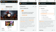
An article's Table of Contents (ToC) is, as you know, a critical piece of the interface for communicating the overview of the content, showing how the content is organized, and navigating that content. On mobile, the ToC's navigational role becomes more necessary, but its overview role could become borderline obtrusive if the user has to scroll past to reach the content. To solve for this, we looked at three different options:
- A ToC as part of the article page itself, beneath the infobox and introduction
- A floating ToC bar that scrolls with the user
- A floating ToC icon that scrolls with the user and can invoke the bar when pressed
The Growth and Design teams poured over these options and ended up selecting option 3, as it increases the utility of the ToC for navigational purposes while also making it more accessible to users as they read. Fandom used to have ToC on mobile and we're bringing it back because it's a great usability enhancement.
Galleries[]
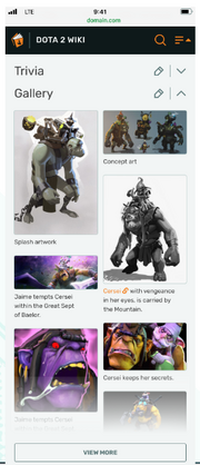
With Galleries, we heard loud and clear that there were two major issues with how Fandom galleries transform onto mobile: the lack of captions to provide necessary context and the mosaic layout skewing the priority of images. Again, we looked at 3 design options:
- A vertically-scrollable list of images with fixed width and variable height, displaying captions below the image.
- A vertically-scrollable mosaic of two image columns with variable height and fixed width, displaying captions below each image
- A vertically-scrollable mosaic of two image columns with fixed width and height, displaying captions below each image
The working group decided on option 2, which you see above with the funny mismatch of Dota 2 images and Game of Thrones captions. Option 2 provided the best mixture of image quality and quantity by not forcing a crop to conform with the fixed height but also showing images side by side. You'll notice that caption display was a big priority for us, which was based on user feedback.
Lightbox[]
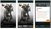
With the lightbox, we wanted to make sure that users got to engage with the larger image, read the caption, navigate to other images, and get useful information about the licensing (should it be relevant), an experience that does not occur at all on Gamepedia today and only partially on Fandom. Rather than send the user to a second page for license details, as we originally explored, we opted to make that experience a pop-under box that can be invoked with that information button to reduce the number of page visits required to find this information. Combined with the gallery enhancements, we think this is a great improvement, especially for communities with a lot of stills, screenshots, and artwork.
Prefer Desktop view?[]
Fandom also has a desktop view, FandomDesktop, accessible both from desktop and mobile. You can easily switch between these two skins with the button under the footer at the bottom of every non-discussions page. Click the "View full site" or the "View mobile site" buttons to switch.
Feedback Collection[]
For submitting feedback on the new experience, please contact your Community Manager (if applicable), file a support ticket, or contact us on our official Discord server. We welcome your thoughts and constructive criticism on the future of wikis on mobile web!


