- This extension is enabled by default on Fandom.
Infoboxes are like fact sheets or sidebars in magazine articles; they're designed to present a summary of the topic of the page. They present important points in an organized and quickly readable format. Infoboxes are generally made using templates, to create consistency across a community.

A sample infobox
Fandom has developed a consistent way to code infoboxes, called Portable Infoboxes, to enable them to display well across different devices, which this page details. There are no changes to how you use an infobox on an article — instead, the changes affect how it is written on a template page. Fandom considers use of Portable Infoboxes to be standard for their communities, and safe and stable for common practical use.
- Useful links
- For a basic intro to the visual infobox editor, see Help:Infoboxes/editing
- For a detailed list of all the standard options available for Portable Infoboxes, including samples of wikitext to use and their HTML output, see Help:Infoboxes/Tags
- For detailed information about how to use CSS to theme an infobox, including detailed guides, see Help:Infoboxes/CSS
- For step-by-step instructions on how to migrate from a 'classic' infobox to a portable infobox, see Help:Infobox migration
- Portability Hub: Guides, examples, and personal mentoring for migrating, customizing, and theming your infoboxes
How to add an infobox to an article[]

Inserting Portable Infoboxes in the VisualEditor
You can add an infobox to an article the same way as you would any other template, either via the editor's built-in tools, or through the editor's source mode. In the VisualEditor, Portable Infoboxes can quickly be inserted via the Infobox option on the 'Insert' dropdown.
Meanwhile, in source mode, you would generally start by copying the syntax from the template's documentation (normally found towards the bottom of the template's page) and pasting it into an article, changing the words after the equals signs to provide the desired information. For example:
{{Infobox character
 | title         = Daisy
 | image         = Example.jpg
 | imagecaption  = Daisy, blowing in the wind
 | position      = Supreme flower
 | age           = 2 months
 | status        = Active
 | height        = 5 inches
 | weight        = 20 grams
}}
With Portable Infoboxes, this works similar as with any other template. The template page markup is a little different, as detailed below.
How to create an infobox[]

First, start a new template with any name you like. To do this, create a new page with the title "Template:[name of your choice]" (e.g., Template:Example). The easiest option for non-technical users, is Special:InfoboxBuilder, which can be access simply by creating a template page and clicking the "Infobox" option when prompted. Your other option is to code it yourself using <infobox> tags. We'll begin with a basic 'stacked' infobox, with a title and an image:
<infobox layout="stacked">
  <title source="name">
    <default>{{PAGENAME}}</default>
  </title>
  <image source="image" />
</infobox>
This wikitext will tell your template to use name and image variables for title and image elements. Additionally, you can provide the <default> tag, whose value will be used when a user does not specify a name/image/etc. on the article.
Now we just need two more fields containing additional information, so let's add one:
<data source="parameter-1">
  <label>Label 1</label>
</data>
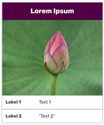
After adding one last field with source set to parameter-2 and label to Label 2, we end up with the following:
<infobox layout="stacked">
  <title source="name">
    <default>{{PAGENAME}}</default>
  </title>
  <image source="image" />
  <data source="parameter-1">
    <label>Label 1</label>
  </data>
  <data source="parameter-2">
    <label>Label 2</label>
  </data>
</infobox>
We can now use the template in an article, inserting the following parameters to get a working infobox:
{{Example
 |name        = Lorem Ipsum
 |image       = Example.jpg
 |parameter-1 = [[Link|Text 1]]
 |parameter-2 = "[[Text 2]]"
}}
Hiding values[]
Any field or element without a value will automatically be hidden. This applies to all tags with the exception of groups that are forcibly shown (see #Force all group elements to be displayed) and those fields with a <default> tag. When all elements are empty the infobox itself will not appear. Inside an <image> tag, images that do not exist will not show a "redlink", but the file page will appear in Special:WantedFiles.
How to alter the infobox layout[]
Infoboxes using this kind of code are automatically styled, taking cues from your community's custom theme. If any of the variables are empty, the relevant row of the template will not be displayed (unless the <default> tag has been used).
Layout options[]
Two alternative layout options are available for infoboxes:
| Default (table) layout |
|---|
| Labels are displayed to the left of the values |
<infobox>
   ...
</infobox>
|
| Stacked layout |
|---|
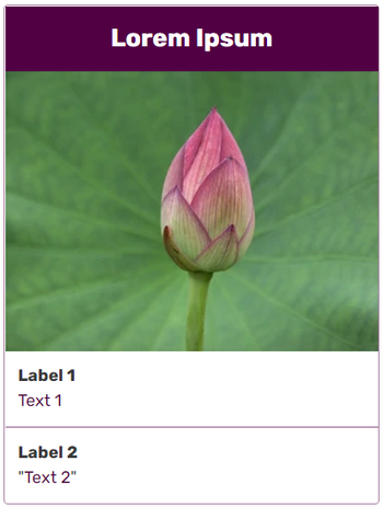
| Labels are displayed above the values |
<infobox layout="stacked">
   ...
</infobox>
|
Custom theming[]
There are a few different ways to customize the look of your infoboxes. It is recommended that you don't mix these too much as it can become confusing to others trying to understand how the styles are being applied.
- The default infobox color scheme depends on the color choices made in Theme Designer; the overall background color will be the same as the "Article background color", the title and headers will have the "Accent color" for a background, and the border will be a semi-opaque version of the accent color. (There are other dependencies, but they are beyond the scope of this help page. See the FandomDesktop conversion guide for details.)
- Complete control of the theme for infoboxes will require modifying the local community CSS. The
portable-infoboxclass can be used to target all infoboxes on the wiki, and using the type, theme, or theme-source attributes on an infobox tag will add classes that make it easy to theme-specific infobox templates. (For lots more information about how to use these attributes and theme an infobox, including detailed guides, please check out Help:Infoboxes/CSS, or find example styles and themes on the Portability Hub.)- The type attribute is used to define an infobox's logical type (like "character" or "item"). All infoboxes of the same type will get the same CSS class.
- The theme attribute is used group infoboxes by a theme (like "season 1" or "Halloween"). All infoboxes of the same theme will get the same CSS class.
- The theme-source attribute allows you to change the infobox theme based on a template parameter. Say you had creatures that were borne from the ancient Greek elements. The theme of the infobox can be changed based on whether the user sets the parameter element to Air, Earth, Fire, or Water, for example.
- The text and background colors of the headers can be set for each instance of an infobox using the method described in Accent colors below. This method produces in-line CSS that overrides all other methods but is limited to just the title and headers.
Accent colors[]
The colors of title and header backgrounds and text can be further repainted per-infobox by using the accent color feature. Like theme-source, the color used is the value of the template parameter indicated in accent-color-source (for backgrounds) and accent-color-text-source (for text).
As an example: if the infobox template declares accent-color-source="bkg" and the article's infobox declares bkg = #FFF, the background color of the headers and titles will be #FFF (the HEX value for the color white). The colors declared in this way must be in #FFF or #FFFFFF HEX format, or the recoloring will silently fail.
Accent colors will override colors declared using themes as well as defaults.
Default colors may also be specified in case the user does not set the bkg parameter to a value in the example above. Using accent-color-default="#FFF" sets the color for all titles and headers backgrounds, and accent-color-text-default="#000000" works in a similar manner by setting the default text color to black.
Per-item styling[]
Individual items in an infobox may include markers inside the HTML results that allow them to be indicated with CSS selectors known as data attributes.
- All Portable Infobox elements that have an input of source will now render in HTML with that parameter name in a data-attribute, such as data-source="ATK". This will allow you to write CSS or jQuery selectors such as .pi-item[data-source=ATK] to style and identify individual items. Used in combination with type, this should eliminate the need for nth-of-type style selection and opens up other possibilities for design and interactivity.
- The new name attribute allows explicit selection of elements whether they accept a source input or not, including identification of <title>, <group>, <data>, <header>, <image>, and <navigation>. Much like the data-source data attribute, <data name="bar"> can be selected as .pi-item[data-item-name=bar].
How to use multiple images or videos[]
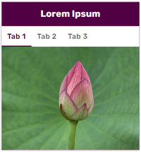
Tabbed images
To use multiple images in one location in an infobox, you can simply pass a <gallery> tag to the image parameter.
{{Example
 |name   = Lorem Ipsum
 |image  = <gallery>
Example 1.jpg|Tab 1
Example 2.jpg|Tab 2
Example 3.jpg|Tab 3
</gallery>
}}
To add a video into an infobox, simply use the <image> tag, just as you would with an image. When a video is inserted instead of an image, a thumbnail with a play icon and duration info will be shown in the infobox, and clicking on the video will pop up a video player. If you want to add multiple videos, add a new <image> tag per each video.
How to group data[]
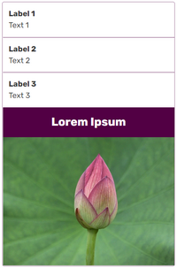
Unusual order demo
Now that you have created a simple infobox, you can learn how to use more advanced options. In the section below we show how to build the infobox seen on the right.
This infobox begins with three <data> fields, then single <title> and <image> fields. As you can see, the <title> field does not have to be the first field.
<infobox layout="stacked">
  <data source="parameter-1">
    <label>Label 1</label>
  </data>
  <data source="parameter-2">
    <label>Label 2</label>
  </data>
  <data source="parameter-3">
    <label>Label 3</label>
  </data>
  <title source="name" />
  <image source="image" />
</infobox>
Grouping information inside the group tags[]
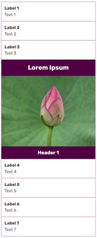
Adding a group
The <group> tag will let you group fields together and give them a header. Remember: fields that are declared but don't have a value won't appear. This rule also applies to groups. If none of the fields (other than the <header> tag) inside a group have a value, that whole group won't show up.
<infobox layout="stacked">
  <data source="parameter-1">
    <label>Label 1</label>
  </data>
  <data source="parameter-2">
    <label>Label 2</label>
  </data>
  <data source="parameter-3">
    <label>Label 3</label>
  </data>
  <title source="name" />
  <image source="image" />
  <group>
    <header>Header 1</header>
    <data source="parameter-4">
      <label>Label 4</label>
    </data>
    <data source="parameter-5">
      <label>Label 5</label>
    </data>
    <data source="parameter-6">
      <label>Label 6</label>
    </data>
    <data source="parameter-7">
      <label>Label 7</label>
    </data>
  </group>
</infobox>
Horizontal layout for groups[]
Instead of a vertical list, grouped fields can have a horizontal layout where all the content is displayed next to each other in single line. This can be achieved by adding layout="horizontal" attribute to the <group> tag.
<group layout="horizontal">
   ...
</group>
Smart layout for groups[]
Similar to horizontal layout (which provides rigid, structured rows) is "smart" layout. This allows data fields in a single group to flow from one row to the next. When the number of fields reaches a defined limit, the next data field will appear on a new row. The items in a row will adjust to fill all available width.
To use smart groups, add row-items="3" (or some other number that sets the limit). All items in a smart group use horizontal layout by default, so it is not necessary to add that attribute if you are using smart groups. However, it is possible to mix horizontal and vertical data fields in a smart group by adding the layout="default" attribute to an individual <data> tag to switch it back to vertical format.
To make a given data field take up more than a single space, use the span="2" attribute in a <data> tag, similar to the way the colspan attribute works on HTML table columns.
<infobox>
  <title source="name" />
  <image source="image" />
  <group row-items="3">
    <header>Header 2</header>
    <data source="parameter-4">
      <label>Label 4</label>
    </data>
    <data source="parameter-5">
      <label>Label 5</label>
    </data>
    <data source="parameter-6">
      <label>Label 6</label>
    </data>
    <data source="parameter-7" layout="default">
      <label>Label 7</label>
    </data>
  </group>
</infobox>
Force all group elements to be displayed[]
Setting the attribute show="incomplete", you can force all group elements to be displayed, even when empty, unless all are empty — then the group is not rendered at all.
<group layout="horizontal" show="incomplete">
  <header>Header 3</header>
  <data source="parameter-8" />
  <data source="parameter-9" />
</group>
Now adding all this together, we come to the final template code:
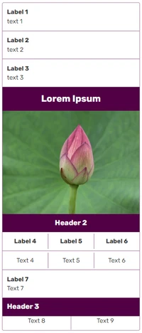
The full infobox
<infobox layout="stacked">
  <data source="parameter-1">
    <label>Label 1</label>
  </data>
  <data source="parameter-2">
    <label>Label 2</label>
  </data>
  <data source="parameter-3">
    <label>Label 3</label>
  </data>
  <title source="name" />
  <image source="image" />
  <group row-items="3">
    <header>Header 2</header>
    <data source="parameter-4">
      <label>Label 4</label>
    </data>
    <data source="parameter-5">
      <label>Label 5</label>
    </data>
    <data source="parameter-6">
      <label>Label 6</label>
    </data>
    <data source="parameter-7" layout="default">
      <label>Label 7</label>
    </data>
  </group>
  <group layout="horizontal" show="incomplete">
    <header>Header 3</header>
    <data source="parameter-8" />
    <data source="parameter-9" />
  </group>
</infobox>
Now we can use it in an article:
{{Battle
 |parameter-1 = [[Text 1]]
 |parameter-2 = [[Text 2]]
 |parameter-3 = [[Text 3]]
 |name        = Lorem Ipsum
 |image       = Example.jpg
 |parameter-4 = [[Text 4]]
 |parameter-5 = [[Text 5]]
 |parameter-6 = [[Text 6]]
 |parameter-7 = [[Text 7]]
 |parameter-8 = [[Text 8]]
 |parameter-9 = [[Text 9]]
}}
Collapsible groups[]
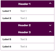
Collapsible groups in action
Groups can be made collapsible by adding either collapse="open" or collapse="closed" to the <group> tag. This will make the group header row clickable (to expand and collapse the group), and the group will initially start open or closed, respectively.
<group collapse="closed">
  <header>Header 2</header>
  <data source="parameter-3" />
  <data source="parameter-4" />
</group>
Note: A <header> tag containing content must be the first element inside the <group> tag for this to work.
Panels[]
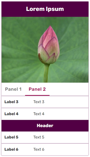
Data items and groups can now be structured in tabbed panels, which allow more flexibility and smarter data display on desktop and mobile views. Each <panel> — as a child of the root <infobox> element — can be divided with one or more <section> elements (and <label> tags) to make a tab set. Any element that could otherwise be a child of <infobox> can be a child of <section> (except another panel - nested panels are not supported). This should reduce clutter and the necessity for groups of infoboxes on pages while structuring infoboxes in more dynamic ways.
The changeable area is formed from two tags: the <section> tag represents the contents of a tab. Inside it, the <label> tag indicates what text to put on the clickable toggle. Labels default to their zero-based index if omitted; but if all tabs within a panel are unlabeled, then they are contained in the infobox as if they were groups.
<infobox>
  <title source="title">
    <default>{{PAGENAME}}</default>
  </title>
  <image source="image"/>
  <panel>
    <section>
      <label>Panel 1</label>
      <data source="parameter-1">
        <label>Label 1</label></data>
      <data source="parameter-2">
        <label>Label 2</label></data>
    </section>
    <section>
      <label>Panel 2</label>
      <data source="parameter-3">
        <label>Label 3</label></data>
      <data source="parameter-4">
        <label>Label 4</label></data>
      <group>
        <header>Header</header>
        <data source="parameter-5">
          <label>Label 5</label></data>
        <data source="parameter-6">
          <label>Label 6</label></data>
      </group>
    </section>
  </panel>
</infobox>
Advanced options[]
Formatting[]
If you want to append some additional information to your data – like adding some icons, categories – or to process the passed values, the field formatting allows you to do that.
- When the
<format>tag is used, the variable provided in the source attribute of the<data>tag can be processed or modified by wikitext. For this purpose, the value of the parameter is accessed by surrounding it with triple braces; e.g.,{{{price}}}forsource="price", just like in other templates. - If the variable provided in source= is empty, the field is not rendered unless a value is provided in the
<default>tag.
A few sample use cases:
- Adding extra text:
<format>${{{price}}}</format> - Providing a default value:
<format>${{{price}}}</format><default>Not for sale</default> - Linking to a page:
<format>[[{{{location}}}]]</format> - Linking to a category:
<format>[[:Category:{{{car type}}}]]</format> - Categorizing a page:
<format>{{{car type}}}[[Category:{{{car type}}}]]</format>
For example, we can insert a {{money icon}} template:
<data source="price">
  <label>Price</label>
  <format>{{{price}}} {{money icon}}</format>
</data>
The effect shown to the right can be achieved with the following syntax:
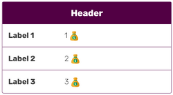
Fields with formatting
<header>Header</header>
<data source="parameter-1">
  <label>Label 1</label>
  <format>{{{parameter-1}}} {{money icon}}</format>
</data>
<data source="parameter-2">
  <label>Label 2</label>
  <format>{{{parameter-2}}} {{money icon}}</format>
</data>
<data source="parameter-3">
  <label>Label 3</label>
  <format>{{{parameter-3}}} {{money icon}}</format>
</data>
Parser functions[]
Parser functions can be added to any infobox. However, the results will be automatically hidden if the parameter, tag, or data source do not contain any text.
<data source="level">
  <label>Rank</label>
  <format>Orc {{#switch:{{{level}}}
              |1=peon
              |2=grunt
              |#default=(unrecognized rank)
              }}
  </format>
  <default>Orc (unknown rank)</default>
</data>
It would not make sense to test for the empty string in the switch statement; e.g., |level= , because that is already covered by the <default> tag.
Accessing template parameters from other data tags can be done by just writing {{{name_of_the_template_parameter}}}. Because the data tag doesn't contain a source, the row will be hidden, unless you put your parser function in the default tag. In the example below, the row will be hidden, if the "start" template parameter is not defined.
<data source="start">
	<label>Starting storage capacity</label>
</data>
<data>
	<label>With Warehouse</label>
	<default>{{#if:{{{start|}}}|{{#expr:{{{start}}}*2}}}}</default>
</data>
Examples[]
Further help and feedback[]
- For information on the 'classic' method of writing infoboxes, see Help:Classic infoboxes
- For more infobox help, see the Portability Wiki, which also covers the InfoboxBuilder extension
- Browse and search other help pages at Help:Contents
- Check Fandom Community Central for sources of further help and support
- Check Contacting Fandom for how to report any errors or unclear steps in this article

