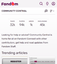
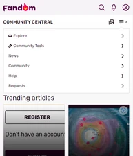
Fandom offers an optimized mobile site for viewing communities while on your smartphone or other mobile device. Around half of the visitors to Fandom communities are using a mobile device! The default mobile experience on the platform is FandomMobile.
When someone visits Fandom using their phone's browser, they encounter what we call mobile web. It's a platform optimized for effortless and speedy article content browsing. It's a little different — but only a little — from the experience of reading a wiki on the Fandom app.
We've optimized our mobile site for the following devices and operating systems:
- Android
- iOS
Luckily, the same tips that help you improve the way your wiki looks on mobile web apply to the Fandom app. Here are a few:
Good things to do
Actually use mobile web
If you personally use your wiki on mobile web, you'll tend to make it look better for mobile web. Your first order of business? Figure out how to access the mobile web!
- Use a real phone when you can. If you are fortunate enough to have a choice between a real smartphone and software emulation, always prefer the real deal.
- Use Fandom's emulation of mobile web when you don't have a real phone handy. Just add
?useskin=fandommobileto the end of the a page's url. Make sure to narrow the window size to simulate a phone screen. And be aware that this method will never precisely emulate what's seen on actual phones. - Remember that most people around the world don't have large phones. A common screen size globally — despite the presence of much wider phones — is still just 360 x 640 dpi. A good rule of thumb is that if you can make your wiki work at that lower width, it'll look good on any phone.
Page organization
If your community's pages are clear, simple and flexible — if they have a clear hierarchy and a simple layout — then your wiki will better adjust to different platforms.
What appears at the top of a page is the first place you should focus your attention. On mobile web, the thing on top is always the infobox. So make sure yours are mobile ready.
Images
Place images next to the text they're illustrating. It's sometimes tempting to move images to another section to better format for desktop display. But on mobile, this means that the images will no longer illustrate the correct text. Instead, they'll end up confusingly located in a different section.
Here are some other thoughts about images on mobile:
- Images that are 50 pixels or smaller will automatically be resized to icons. Such images may be hard to see on mobile web.
Your community's local navigation is an important tool for mobile visitors. Keep it organized, clear, and simple. Use as few words as possible for each heading. And, as always, actually double-check the way it looks on a phone!
What to avoid
Hatnotes
Some communities have used the top of the page for warning templates or other notices — sometimes called "hatnotes". These take up a lot of space on a phone, and many mobile readers aren't willing to scroll through them. Consider moving these types of warnings — which really apply to editors more than readers — to the talk or policy page. If your community disapproves of moving these sort of templates off the page, please make sure that they're given a template type of Notice so that your mobile readers won't have to experience them.
Tables
Be selective when using tables. They're great for data, but horrible for page layouts. Pages that use tables as layouts end up being a lot more inflexible, and difficult to display. Try to use alternative layout tools, such as sliders, galleries or div tags. These are more flexible and work well with varying content sizes.
Even when used properly for data, many tables are too wide, and require swiping to view on mobile web. Please consider carefully whether your table needs as many columns as it has.
Sure, sometimes breaking up tables isn't possible. But sometimes, you may be able to split a table into two parts — each one with fewer columns — and make them both fit comfortably on a phone.
Because navboxes have a widescreen orientation, they just don't fit in a phone held at portrait orientation. You should try to limit the number of navboxes you have on your wiki. Strongly consider whether the navboxes are actually providing a service that categories can't. And always make sure your navboxes have the template type of Navbox.
Inline CSS
Defining elements through inline CSS will make them unavailable on mobile web (with the exception of historically Gamepedia wikis). For example, defining an element with style="background-color: #ffffff" will not change the background color on mobile, but using class="background-white" and then defining .background-white { background-color: #ffffff; } on MediaWiki:FandomMobile.css will. Because of this, it's recommended to avoid inline style and instead use the wiki's CSS page to change how the page appears on mobile. You can read more about mobile CSS here.
FAQ
- Can I edit content?
- Yes. A mobile skin editor is provided.
- How much of Fandom is available on the mobile site?
- All Fandom wiki communities are available via the mobile site.
- Is there any content that I cannot see using the mobile site?
- Most pages with layouts of standard text and photos render very nicely on the mobile site. Certain pages, however, are too complex for mobile-friendly presentation, and will appear less gracefully (e.g. multiple column layouts). Portable Infoboxes are optimized for mobile display.
- Can I switch between mobile and standard views?
- Yes. At the bottom of mobile pages is a link labeled "VIEW FULL SITE". Tap it to reload the same page that is served to desktop web visitors. If you want to switch back to the mobile skin, go to the bottom of the page, then click on the "VIEW MOBILE SITE" link. You can also switch to the desktop view by adding
?useskin=fandomdesktopto the URL, or you can switch to the mobile view by adding?useskin=fandommobile.
- Yes. At the bottom of mobile pages is a link labeled "VIEW FULL SITE". Tap it to reload the same page that is served to desktop web visitors. If you want to switch back to the mobile skin, go to the bottom of the page, then click on the "VIEW MOBILE SITE" link. You can also switch to the desktop view by adding
Further help and feedback
- Mobile help index
- Differences between desktop and mobile (Portability Wiki)
- Browse and search other help pages at Help:Contents
- Check Fandom Community Central for sources of further help and support
- Check Contacting Fandom for how to report any errors or unclear steps in this article


