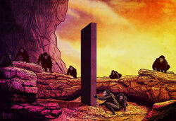
An inspirational box from a cinematic classic
Infoboxes are a traditional part of wiki pages, usually providing a summary of basic facts about a page's topic. They're meant to inform and inspire readers to read the associated page. They can also overload a reader and drive them to frustration.
| Want the tl;dr version? Jump here! |
- Wikipedia links and rationale regarding these topics
- Infoboxes, from the Manual of Style · Law of infobox inclusion
What are infoboxes?
This seems like a simple question for many wiki readers and editors, but many wikis consider the answer differently. An infobox is an element on a wiki page that provides short data, information, and navigation about the main topic of the page. Whether on desktop or mobile devices, the first and most common component on a page is the primary infobox. Readers expect it to contain a brief summary of relevant information so that they can understand the basics of the article text without reading deeply into the narrative.
There can be more than one infobox on a page, but with that comes a risk of confusing infoboxes with a similar concept called "cards". It is also different from a data table, which is a larger element that usually has multiple dimensions or columns tying individual entries together.
Cards
Infoboxes have a lot in common with the typical web / design concept of cards. Where infoboxes typically convey information about the original topic of the article, cards tend to convey sub-topics (like an individual weapon on a page listing weapons, where an individual page is considered too trivial for a full page). Cards also tend to be visually different from infoboxes because they are not anchored to a side and most appear in groups and sets.
Styling
Why is it important for infoboxes to be placed and sized consistently? The strongest answer is based in Jakob Nielsen's Law of Familiarity (commonly called "Jakob's Law") which effectively states: Users spend most of their time on other sites. This means that users prefer your site to work the same way as all the other sites they already know.

Jakob's Law of Internet User Experience
“Consistency is one of the most powerful usability principles: when things always behave the same, users don't have to worry about what will happen. Instead, they know what will happen based on earlier experience. […]
The more users' expectations prove right, the more they will feel in control of the system and the more they will like it. And the more the system breaks users' expectations, the more they will feel insecure. […]
Users form their expectations for your site based on what's commonly done on most other sites. If you deviate, your site will be harder to use and users will leave.”
In 2015, Fandom researched the styling and positioning of infoboxes throughout the network. The research group found that the average width, most common width, and width in the middle of the extreme maximum and minimum (i.e. the median) was consistently 270 pixels. This is also consistent with Wikipedia's basic infobox size (which averages 22em or ≈265px). We confirmed the same findings using internal user experience research in 2019 with a study on wiki consumption habits across both Fandom and Gamepedia. We are confident that the size and positioning of infoboxes is generally expected to be very close to 270px wide in the upper right portion of the article field of view (on pages written in a left-to-right language), and therefore that size should be consistently familiar to most readers for optimal comfort.
For ease of reading, the text and general color scheme of an infobox should be different from the overall narrative. Infoboxes are intended to stand out in contrast from the typical text on the page. When they don't, it becomes more difficult for the reader to interpret where the distinct infobox can be skipped over with the eye.
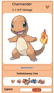
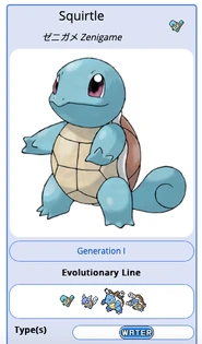
When a whole infobox is styled with a custom theme or color scheme that is different from the majority of other infoboxes, the theme or colors should signal a meaning. For example, a fire-type monster and a water-type monster having different infobox color schemes makes obvious to a reader a very basic piece of information. Less informative color schemes, however, tend to be interpreted as "noise" and ignored by readers.
Composition
Infoboxes are intended to provide highlights and essential data to compliment what is in the article. Fandom has many communities where the infoboxes are longer than the body of the article being described, because there is simply too much information being presented. As a rule of thumb, only add the information that is most critical to understanding the topic on the page.
A key point is that the majority of modern audiences are using a phone to see the content of the page, and the longer the infobox is, the longer it will take before a reader can get to the best parts of the page. If the infobox is more than 5 times as tall as it is wide (especially on short to medium sized articles), efforts should be made to reduce the overall height; an infobox should never exceed two "page heights" in length nor exceed the overall length of the article narrative text.
Titles and Data
Titles are just as important for infoboxes as any other data. They help to visually label a standalone concept. There can be more than one title where two or more titles are equivalent. An infobox should, in general, have at least one title.
A very common situation is when the source for an article’s topic comes from a different language and has multiple equivalent titles. To reduce clutter, maintaining only the most important alternate-language titles (and not listing every possible language variation in the infobox) will streamline the number of rows. For example: if the source language is Japanese and the wiki language is English, a single secondary title with Kanji + Kana — bonus points for proper use of Ruby! — with Rōmaji (in brackets thereafter, or with an abbreviation <abbr> tag) is a perfectly acceptable title row. Literal translations and interlanguage page links are better explained in the body of the article.
Titles differ from data rows visually by not having a visible label. Both are significant to search engines.
Data design
| Some of the distinctions in this section are most relevant to Portable Infoboxes, but the design principles listed are also applicable to infoboxes created with wikitext tables. |
For the ease of reading rows inside, some design principles for good layout of information come into play. A conventional 270px layout on mobile and desktop makes the following harder to read:
- Full sentences, beyond a caption or summary, tend to overload a data point. There are common situations, particularly in gaming where "lore" for a game card provides a multi-sentence description or instructions, to which this applies on a case-by-case basis.
- Lists of values in a single cell written narratively (e.g.: "Alpha; Bravo; Charlie…") and / or listed without bullet points tend to reduce the value and understanding of each item. An exception to this is in short navigation links where the (less than 5) items are few short words each with a distinct bullet or interpunct separating them.
- Multi-level or nested lists, especially where the relationship between levels is unclear, tend to confuse readers.
- Large thumbnail images (such as sigils or maps) or sprites where the label is on the side tend to crowd small screens. This can usually be resolved by placing the label above with a "horizontal" row layout.
- Thumbnail images or icons without a text label make less sense to readers with less than perfect vision, especially if they are looking specifically for the meaning of the icon supplied. This principle also applies to star or bar graph ratings, where the actual number value is more easily remembered or understood than having only the visual. Having text to give the proper value is important for accessibility, data storage, and search engines that otherwise can't interpret the value.
- On a single vertically-oriented row (e.g. “[ Label: ][ Value ]”), placing multiple data points side-by-side (e.g. “[ Label: ][ Value ][ Label: ][ Value ]”) is distinctly difficult to read and interpret. This can usually be resolved by placing the data points on new visual lines or using a horizontal layout (with the label above).
- Very long lists of items inside a data cell (even when hidden or placed inside a scrolling pane). Readers don't see the full scope of the information and may not know to look for it, or worse may not be able to see it. Operating hidden elements on a small screen may be difficult if the toggle is small or unclear, and scrolling a small pane inside a larger pane that also scrolls can be a very frustrating experience with trackpads or fingers. If there is enough information in a single data row that one of these techniques is seen as necessary, it may be that the information is better placed in the narrative of the article.
Adding informational icons to data values is helpful for the user experience to break up text. Adding abbreviation notes or informational tip icons (both via <abbr> tags) can help explain uncommon terms in data labels or headings.
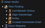
These informational icons (or "infoicons") help to clarify text. A multilevel list like this one can be unclear as to why it is composed like that.
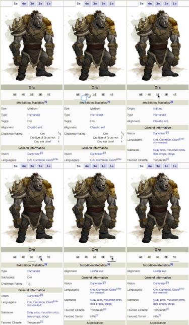
To avoid having multiple primary infoboxes on a page, it can be useful to add nuanced sub-regions to a primary infobox. For example: if the statistics for the same character change across games, a panel with changeable sections to indicate each game may be very useful. This can be done with other tab guidelines in mind to balance the information given visually. The user experience guidelines make more clear that each section should contain more-or-less equivalent information of roughly the same visual size. Where this is not feasible due to a large number of data points / statistics associated with a given section, it may be easier to break that data into tables outside the infobox. The newest or most commonly referenced tab should always be the first listed, as most tabs beyond the first decline in how often they are seen. The content of secondary tabs is considered by search engines (and most humans) lesser in importance or value, and if this should be more prominent a data table will most likely be more visible. Primary images and image galleries representing primary images in infoboxes should always be outside tabbed panels, as they are not recognized by search engines or MediaWiki tools in most cases otherwise.
Knowledge Graphs and search engines
Google loves infoboxes. When they are crafted with consistent code (as is produced by Fandom's Portable Infoboxes), search engines like Google can easily understand and interpret the basic facts of a page and integrate those findings into widgets in results pages (typically called Knowledge Graphs). When too much information is given in an infobox, it is collected and could be displayed in the Knowledge Graph to the point where visitors may never see your page. A good balance comes in showing enough information to pique a reader's interest, but not enough that they are overloaded by just the infobox and don’t wish to read deeper into the page.
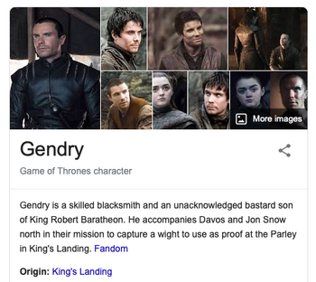
Gendry's Knowledge Graph widget on Google. Note that Fandom is listed as the source.
Keep in mind also that evergreen information (i.e. information that is true throughout most or all of a chronicle or storyline or media) is preferred, because spoilery information tends to disappoint and give away parts of the experience. For example, a character who changes their name in the last moments of a movie trilogy should be known in the infobox by the name used throughout, or important plot points can ruin the viewing of the films. A character who is alive, dead again, and alive once more should generally just have "alive" as the data in their infobox (if that data row has to be there at all); otherwise the information supplied to readers and search engines alike can be confusing and contradictory at best.
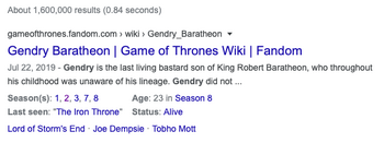
Gendry's result page on Google
Search engines also love finding navigational links between strongly related articles; it groups the concepts on the linked pages together as having an important relationship to each other, or two views of the same idea. Adding navigation links to the infobox also helps mobile readers to consistently find where they are truly trying to go, because unlike custom tab elements these links are in familiar places and not as easily skipped over by the eyes.
Just the facts
- The tl;dr version
- The infobox should be a summary of data points and contain the most informative points about an article's topic. It should not go into detail.
- Infoboxes work best for readers when they are sized and positioned in the traditionally conventional way.
- Simple construction provides the most worth to readers and search engines.
The conversation is always open in our Discord server's #best-practices channel, and we invite you to participate with questions and concerns.
Click here to follow the Fandom staff blog.
Click here to sign up for the From the Desk of Community email newsletter.
Join our Official Discord server for registered editors!
- THE MONOLITH - 2001 A Space Odyssey illustration by HalHefner.
- Screenshot from Guild Wars Wiki of experimental icons used under Fair Use
- Screenshots from various wikis throughout Fandom and Gamepedia, CC-by-SA 3.0.

