Contrast ratios (CR) describe a mathematical relationship between the background and foreground of a bit of text on your wiki. That math gives a wider range of people the opportunity to comfortably read your wiki.
Understanding visual acuity[]

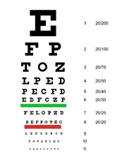
We're all shooting for the 20/20 line on this American eye chart.
Consider visual acuity. It's a measurement of how well you can read black letters on a white background from a particular distance, and it's something you've probably done before.
Think about your eye doctor's office. In the US, patients are seated 20 feet from the chart. Visual acuity is a fraction where the numerator is 20 and the denominator is the number assigned to the smallest line on the chart that a person can read. Statistically average visual acuity is being able to read the line marked 20 from 20 feet away: 20/20[1] — or 6/6, if you use the metric system.
Finding the contrast ratio[]
The visual acuity fraction is directly related to the contrast ratio — a mathematical expression of the comfort a person has in reading your wiki. The highest ratio is 21:1, which is black text on a white background — or white text on a black background. The lowest is 1:1, meaning that both background and text are the same color.

Adhering to the web standard doesn't mean you're stuck with boring blacks and whites. This gold-and-purple combo easily passes the AAA mark, as do tens of thousands of others.
A person with 20/20 vision could probably see a page with a 2:1 contrast ratio, but it wouldn't be pleasant. So the minimum contrast ratio for the normally-sighted is 3:1.
But you can't deliver a wiki that's only good for people with 20/20 vision. That's why the World Wide Web Consortium (W3C) recommends two standards: AA and AAA.
With AA, the aim is to account for people who have 20/40 vision by providing a CR of 4.5:1 for regular text, and 3:1 for larger copy[2]. AAA has a minimum contrast ratio of 7:1 for regular text, and 4.5:1 for large text[3].
For both standards, good non-text contrast is also needed. It applies to graphic elements, such as icons, that are required to understand the wiki content. These need to have a contrast ratio of at least 3:1[4]. For example, an icon indicating gold in a game is used in an infobox instead of the word "gold"; it conveys information, so it should be visible.
This higher rating will allow people with 20/80 vision to comfortably use your wiki. Those with worse than 20/80 vision usually employ additional assistive technologies, making that the lowest visual acuity that needs to be considered by your CSS alone[5][6].
References[]
- ↑ Hellem, Amy and Gary Heiting, OD. "Is 20/20 Vision "Perfect" Vision?". allaboutvision.com. Updated September 2017.
- ↑ WCAG 2.1 Success Criterion 1.4.3 Contrast (Minimum). Level AA
- ↑ WCAG 2.1 Success Criterion 1.4.6 Contrast (Enhanced). Level AAA
- ↑ WCAG 2.1 Success Criterion 1.4.11 Non-text Contrast. Level AA
- ↑ Contrast (Minimum) Understanding SC 1.4.2. W3C.
- ↑ Contrast (Enhanced) Understanding SC 1.4.6. W3C.
See also[]
Related topics here at Fandom[]
- An introduction to this topic
- Including the color-blind at your wiki
- An overview of wiki design
- A video town hall about CSS with a section about color theory, starting roughly at the 58-minute mark.
Around the web[]
- W3C Web Accessibility Initiative's guide to colors with good contrast
- An interactive examination of the importance of contrast in web design
- Colorable - a simple contrast-checker for when you're planning your wiki's color palette.
- WCAG Contrast Checker - a tool for checking if the contrast meets WCAG guidelines for AA and AAA standards.
- W3C's list of contrast ratio checking tools
- The Braille Institute's digital tech section and various free apps that help you simulate several eye disorders.
Further help and feedback[]
- Browse and search other help pages at Help:Contents
- Check Fandom Community Central for sources of further help and support
- Check Contacting Fandom for how to report any errors or unclear steps in this article
