scrappystickyinkymess


1 Comment

Making Brushes – or are they stamps?

Just a weird sort of post on a Friday. It’s Darling Daughter’s actual birthday today, and we have plans.

I go down a rabbit hole sometimes, and after making all the tags, I was very much in the mindset of digital designing. After playing with all the vintage patents, on of the things that really appealed to me was the lovely hand lettered text, especially the Fig. 1, Fig. 2 numbering. What is that called? There must be a name for it – I just don’t know what it is! But this is what I am talking about:

Some of the lettering is pretty amazing – it’s close, soooo close, to looking like it was printed, but sometimes the minute variations, especially in the really old patents, make it clear they were drawn by hand. It’s the kind of little detail that would be fun to add to digital designs, for junk journal kits etc. When I was talking about the steps I had to take to get the images from the patents in the right sort of format to be able to use them in the way I wanted, one commenter, Rene, mentioned the problems with Affinity not having an auto-trace (or image to path) function. I had the idea to extract a bunch of “sets” of these numbers, so people might be able to use them in a variety of ways. But the process, well, it was cumbersome. Now I am only saying that this is how *I* do it, using the tools I have, and know, without having to buy anything else, and don’t suggest this is the only, or even the best, way to do it.

  • I download the patent PDF from the patent site
  • I export the individual page as a .JPG, at 300 dpi
  • I drop the white-background image into a background remover (and of the ones I have, I find Creative Fabrica‘s one works like a dream) and I think it might even be free to use, even if you don’t have a subscription, I’m not sure.
  • I download the transparent .PNG and open it in Preview (Mac) then copy just the very small area I want and drop that into Intaglio. It’s the function Affinity needs
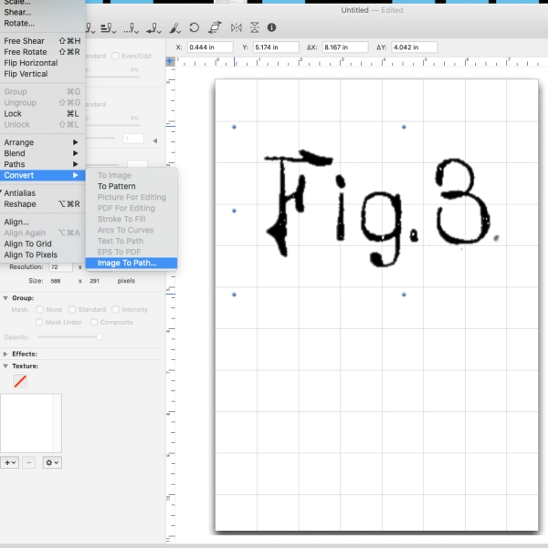
I like that there are some options for resolution and more I can change – and I haven’t even played properly with all the elements. There isn’t a lot of info about Intaglio out there anymore.
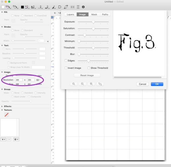

That gets me a clean PNG of the bit I want.
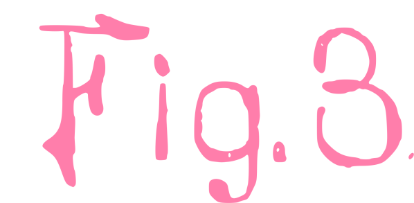
I happened to make it pink but I would normally do black. Rinse and repeat, as they say, till I have a while load of them, all as PNGs – maybe you can see what I mean about the slight variations if the letters and numbers that show you they are not simply printed or a font.
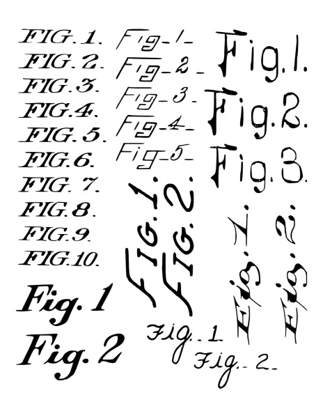
My original plan had been to do them as a PNG sheet and a PDF where each element can be extracted as an individual snippet, but then I thought What about making them digital “stamps” that work as Brushes in Affinity? I gotta say that opened up a whole other rabbit hole cause there are some things about that process that are super confusing. I did manage it and once I worked out the details it wasn’t even super hard, just all a bit, IDK, repetitive and dare I say tedious. But am pretty happy with the results.

Sorry, hope that wasn’t too boring and tedious for you – I am hoping to use them in some designs to see how they work in action just to make sure they perform as I expect them to! I am also working on a Holiday-themed digital kit. This might be the year I do a December Daily. Maybe…


Leave a comment

Last sets – Christmas Circle Tags to Print

OK so this the last of them – probably.

There are three sets and I tried to group them a bit logically so if you are wanting to coordinate your tags to your decor you can.

The more traditional Red and Green can be found here

The Kraft & White and Sad Beige mix is here

The Subtle, non-traditional colours version is here

As the other sets, these are all 300 dpi JPG sheets to print and cut, punch or Scan&cut. They should fit a 2.5 inch punch or die. Here’s hoping you find them useful.

I know this is probably a shock – I never even usually think about Christmas till after Thanksgiving, and in fact we did have a Faux Thanksgiving early with my in-Laws while they were here so technically it is after Thanksgiving…

{wink}


Leave a comment

White Christmas Tags – Economical to print

As promised, here are a couple of 300 dpi JPG sheets of tags in red and green to print.

You can download the RED version here

You can download the GREEN version here

I am always open to suggestions, so if there is a particular colourway that really would make these perfectly fir your Christmas colours, I could consider doing these in other colours. Most helpful would be the RGB, CMYK or Hex colour codes.

Darling Daughter has a birthday party this weekend and after the infusion I doubt my ability to be very productive at all. Luckily, not worrisome severe drop in BP and no throat closure and not another 9 hour day so I’ll take that as a win. Pretty useless yesterday, we’ll see what today brings. But I will have one last set of tags, likely to be all circles, as those are easy to punch or die cut (or Scan&Cut) which might be a real time-saver. And yeah, no clue what next week will bring.


3 Comments

Is this a cheat? Maybe…

OK so I said a A Week of Collage and this is, sort of.

I was pretty happy with the circle collage from yesterday in the end. I do know I need to stop orienting any focal point type image portrait style! I need landscape for the covers, and while I can digitally chop the image and re-orient it, it isn’t ideal. But I thought I would do both of the scanned collages as both of them have a focal point that is oriented portrait.

I think I have two options for creating an 8×10 inch sheet – I can chop an area from the middle or I can rearrange bits and pieces to get what I want. For the green sheet, it isn’t just that the focal point is the wrong orientation, it’s on the wrong side of the page! When folded it would be either on the back or upside down. So digitally cutting up the sheet and placing the focal point where I want it to be is a better option.

To be fair, that is a rather quick and dirty job, but I actually like it a lot.

And believe it or not, I have exactly the same issue with the circle collage. DOH! It’s like I do it on purpose, but I assure you I do not. What’s more, the face is just that little bit too wrongly placed if I want the edge of the collage to be n the fold of the cover. See?

So I ended up doing a bit more fiddling, changing the horizon so the text looks not perfectly straight, but at least less wonky. Also positioning things better, without having to totally cut and paste. Once again, got it to a place I liked better.

So yeah, kinda collage, digital stylee LOL! I’ll be creating a new one for tomorrow, although it’s WOYWW day and I might be knitting, this time with MIL joining in, so it could be an interesting day, desk hop wise. And as it’s the big 800, kinda momentous.


Leave a comment

Scanned painted paper, tweaked

I have been playing with my scanned papers and tweaking them to create slight variations.

The original looks like this:

And here are some collections of variations:

For some of them the differences between them won’t come thru – I can see a stark difference between the top trio and the bottom set, and both are different from the original but the differences between those in the two groups are not as clear as you see them here than I see them in my editing program. I love the last one of the trio, the slightly purple tones are great, and I like the intense bottom left of the quad, I think either one would work for my next Daily journal, and that would be May.

I have been working in my February journal and this is the one with the lined pages. I find I am liking that, better than the heavier unlined pages from the January one. But do I like them more than the Amazon recycled paper pages of all of 2023? I’m not sure. Unlined pages do give me the option to write bigger if I have less to say, while the lines help keep me on track with my messy handwriting! 

Just for fun, I had a simple play with the other photo of the paper I like less. Interestingly, I actually quite like the tweaked version of THAT more than expected! Just amping up the brightness and the contrast makes it all just POP so much more.

I may find a use for that – I think I feel another art journal page coming on….


Leave a comment

Not quite managed any physical art

but I have added a few digital designs to Creative Fabrica. They had a great sale, it might still be going on, so if you newly subscribed to this resource, all my stuff is free over there. I’ve not added it to my Ko-Fi shop yet but will eventually.

I love some of these kits so much. The Typewriter Patents were so much fun to make and the vintage Money one was very interesting – who knew that railways issued their own money? Or linen companies? I didn’t! And I am thinking a couple of these might make nice Daily Journal covers as well – the Ledger Library one in particular, but maybe the coffee one too.

Now, I had not planned on adding any more haul stuff, but I did have a few more things so I might as well. I found a couple of things at the Dollar Tree – if only The Works worked the same and offered similar for £1!

I have yet to assemble the brush organizer but I think it will be handy. I also grabbed a couple of things at office supply stores:

Love those massive letter stencils and my stash of metal edged tags is running low. The Adding machine paper is great for snippet rolls.

Last thing, promise, are a couple of books. My Dad gave me his copy of Killers of the Flower Moon and the knitting book was a gift from my MIL for my birthday.

Now, as my weekend was completely consumed with a late Thanksgiving feast and a veritable MOUNTAIN of laundry, it was really all I could do to get this posted. But I have high hopes I will now be able to do something arty for tomorrow. I was really happy to have had all my posts for the time I was away sorted in advance but now I am back to daily blogging (well M-F anyway) so better get cracking. I am now WAY behind with Fodder School, the Roben’s Nest, a couple of freebie classes… Oh dear. And Christmas is just around the corner…


Leave a comment

More printables – Women Set Sail!

I found a real treasure trove of photos – loads of super quirky shots of what seems to be a group of circus performers setting off on a cruise! There are a ton of them. I picked out my favourite ones to make a printable sheet. I have it up over on Ko-Fi if this sort of thing appeals to you. And how can it not? Check out the tattoos on this lady:

Some of them give a clear indication of what their talent is:

I’m guessing the lady on the swing is a trapeze artist? Maye a couple of acrobats or dancers? Anyway this is a small selection of the women, because the post-processing of the originals takes a bit of time, and Fodder School is also taking up a bit of time. There is a bit of one of the classes that makes use of this sort of photo that I am eager to do, so, as ever, I make things *I* need and if they are helpful to someone else, well that’s great too. But back to Fodder School classes for now…


1 Comment

Not totally ignoring digital designing…

…but it kinda took a back seat. Until *I* needed something lol! Funny how that works. One of the Fodder School classes was making little clusters. And I needed some photos to use for them. The class itself included a few in a printable pack, but of course I wanted to use something more unique. I had a meander thru a few public domain sites and collected a ton of fun photos. Then spend a day cropping and editing them to where I wanted them. I thought I would try something a bit different and just put them up of Ko-fi and see what happens. I recently decided to pay for some additional storage on my blog (bet you wondered why I went back to adding loads of photos…) and I’d like it to at least be…self-sufficient I guess.

The clusters were detailed in the class, a great one, so I won’t share any details (sorry, but thems the rules) but I can show the finished items.

And a close up of a few of the photos themselves:

No idea what exactly is happening in photo one – clearly some sort of ocean explorer and his wife – or in photo two, with that thing on her head. And the last photo is one of a ton of cruise ship send off photos, and many are at least slightly quirky!

Here is a peek at just one sheet:

I opted not to print the sepia version but now kinda wish I had. Any way I did pop them up on Ko-fi and I’ll see what happens. Probably not a lot, but it’ll be interesting as an experiment at the very least.


9 Comments

Cat ephemera and thoughts…

{sigh} This is getting to be a habit. I troll happily thru all manner of interesting resources I find, some actual physical things (books or papers) but more digital resources housed in many wide and varied collections but available online, then all of a sudden BAM! I am hit with crazy racist images or statements or misogyny in full flower or just shocking and unexpected whatevers.

I am not going to include them here, you will just have to trust me on this.

I was quite happily converting some posters advertising a defunct short story collection magazine when I saw something that made me gasp. Not the worst I’ve seen but so darn unexpected. You can imagine why I was keen on these images…

Poppy is actually a Tuxedo Cat, I’m told, as she has a white chest and paws and a few white markings on her face, but still….

I was enjoying the work, cleaning up all the extra text and had an eye towards using a bit of one somehow in a Christmas card – cause ain’t she festive? And regal! LOL!

Kinda took the wind out of my sails for a moment. I know that times have moved on, but then I think of current real life happenings that also take my breath away, and I think maybe we haven’t progressed as humans quite as much as we might like to think.

Whoa. Too deep for a Monday morning? Perhaps.

To lighten things up a bit. while looking at those images, I also found these wacky ones. They made me smile – wish there were more cause I think they are so stinkin’ cute!

Although, I sense the high-wire gal juggling knives shares my feelings today…


4 Comments

Working on a fun journal addition…

…or is it? I get these ideas, spend far too much time working on them, then in the end I sometimes totally abandon them if I think they were not really so great. I am on the fence about this one.

These little foldable structures are meant to get added to a journal. Lots of uses, I think. I like to create a small stack of lined or grid papers then make that into a small booklet.

It kinda hides the pretty butterfly, although I only stick the booklet at the top edge, so you can flip it up to see that if you care to. Fold it all back into a closed square and…

I have a kit al ready to go, with four different printable squares, four backing papers to coordinate, and four coordinating grid papers. and yet I hesitate.

Thoughts?

To be fair I might just go ahead and add them, cause they are cute, and really, I feel like someone will like them. But then I thought that about the pretty Lichen-dye swatch ones and they are still totally unloved. OK, well one WOYWW friend did say she liked them but still, no one adores them like I do. I am just waiting for the old set to get removed so I can add the new ones. Sneaky peek, anyone?